Author: admin

  • Meta Ads performance analysis: How to measure what’s working

    Meta Ads performance analysis: How to measure what’s working

    Anyone can open Meta Ads Manager and see what a campaign did yesterday. That is not analysis. Analysis is the harder, more valuable habit of looking across time, across campaigns, and across tests to work out what is actually driving results, what is quietly wasting money, and what you should do more of. It is the difference between reacting to a single day’s numbers and steering an account with intent.

    This guide lays out that process. Not what each metric means in isolation, which is a separate skill, but how to measure performance in a way that produces decisions: what to scale, what to fix, what to kill. If you want a refresher on the individual numbers first, our guide on how to read a Meta ads report covers each metric in detail. Here, we assume you know what the metrics are and focus on what to do with them. 

    You can run the whole process inside ContentStudio’s Meta ads analytics, which keeps the historical data, comparisons, and trends in one place, but the method matters more than the tool.

    Start with a question; the dashboard comes after

    The single biggest mistake in performance analysis is opening the dashboard with no question in mind. You scroll, you notice a number that looks off, you chase it, and an hour later you have learned nothing you can act on. Data will happily absorb as much time as you give it and hand you nothing in return.

    Good analysis starts with a question you actually need answered. Something like: is this campaign more efficient than it was last month? Which of my three audiences produces the cheapest purchases? Did the new creative beat the old one? Is my spend going up faster than my results? Each of these has a clear shape, points you at specific metrics, and ends in a decision. The dashboard becomes a tool for answering the question rather than a place to wander.

    Before any analysis session, write down the question in one sentence. It sounds trivial, but it changes everything. It stops you from confusing activity with insight, and it means that when you close the report, you have an answer and a next step instead of a vague feeling. Every section that follows is really just a different type of question, and the metrics you reach for depend entirely on which one you are asking.

    Compare against something, always

    A number on its own means nothing. A cost per purchase of forty dollars is neither good nor bad until you compare it to something: last month, another campaign, your target, or your break-even point. Analysis is comparison. This is the habit that separates people who understand their account from people who just look at it.

    There are four comparisons worth building into your routine, and each answers a different question.

    • Against time: Compare this period to the last one. Is cost per result trending up or down? Is spend outpacing results? Time comparison is how you catch slow decay before it becomes a crisis, and it is the one most people skip because a single day looks fine in isolation.
    • Against your target: Every campaign should have a number it needs to beat, usually a maximum cost per result or a minimum ROAS tied to your margins. Measuring against that target turns a vague “is this good” into a clear “is this above or below the line.”
    • Against other campaigns: When two campaigns chase the same objective, comparing them shows you where to move budget. The catch is that they must share an objective, or the comparison is meaningless, which is why grouping results by objective matters so much.
    • Against the account average: A campaign that looks expensive might be perfectly normal for your account, and one that looks cheap might be an outlier worth studying. Your own average is often a better benchmark than any published figure.

    The tool you use should make these comparisons quick, because friction is the enemy of a good habit. If pulling last month’s numbers next to this month’s takes ten minutes of exporting and reformatting, you will not do it consistently. 

    This is one of the quieter reasons teams move analysis into a dedicated dashboard like ContentStudio rather than working out of raw exports: the comparison you should run every week is the one that has to be effortless.

    Why trends matter more than snapshots

    A single data point tells you almost nothing. A campaign can have a terrible day for reasons that have nothing to do with the campaign: a weekend, a holiday, a tracking hiccup, a competitor’s sale. React to that one day, and you will make a change you regret. The signal lives in the trend, not the point.

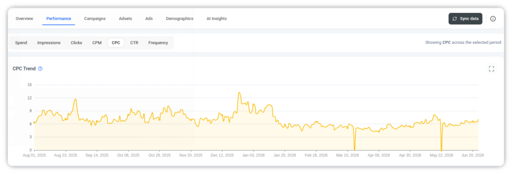
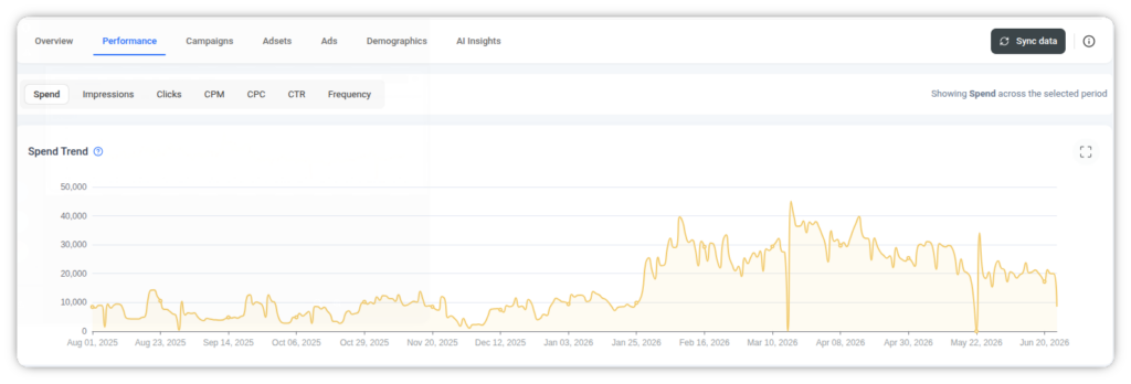
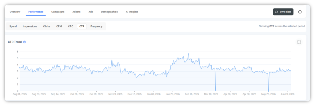
    This is why trend charts matter more than tables for real analysis. A table tells you what happened. A line over thirty or sixty days tells you the direction, and direction is what you act on. When you plot cost per result over time, a single spike is noise, but a steady climb over two weeks is a story worth investigating. When you plot spend against results on the same timeline, you can see the exact point where pouring in more money stopped producing more outcomes, which is one of the most valuable things analysis can reveal.

    The practical discipline is to always zoom out before you zoom in. Look at the trend line for the last month or two before you touch a single day’s figures. Ask what direction things are moving and how fast. Only once you understand the trajectory should you drill into a specific day or campaign to explain it. 

    Isolate variables when you test

    A huge part of performance analysis is figuring out which of your changes actually worked, and that is only possible if you test cleanly. The rule is simple and constantly broken: change one thing at a time. If you launch a new creative, a new audience, and a new budget on the same day and performance improves, you have learned nothing, because you cannot say which change did it. You have three suspects and no evidence.

    Clean testing means holding everything steady except the one variable you want to measure. New creative against the same audience and budget tells you whether the creative is better. Two audiences with the same creative tells you which audience is stronger. This discipline is what makes your analysis trustworthy rather than a guessing game dressed up in numbers.

    A few habits make testing analysis reliable:

    • Give it enough time and data. A test read after two days and forty results is not a conclusion; it is a coin flip. Let a test gather enough outcomes that the difference between variants is real and not random.
    • Define the winning metric before you start. Decide in advance whether you are judging on cost per result, CTR, or ROAS. Choosing the metric after you see the results is how people fool themselves into declaring whatever they hoped for as the winner.
    • Write down what you changed and when. An account without a record of changes is impossible to analyze, because you cannot connect a shift in performance to the thing that caused it. A simple log of dates and changes is worth more than most fancy tooling.

    That last point deserves weight. The single most useful analysis asset is not a chart; it is a record of what you did and when, so that when performance moves, you can line it up against your own actions. 

    Segment to find where performance really lives

    Segmentation is the practice of breaking a number down until it tells you something specific. The same spend and results can be sliced by audience, by placement, by creative, by device, by age and gender, by country and region. Each cut can reveal a pocket of performance the average was hiding. 

    The classic finding is that one segment is quietly carrying the campaign while another is quietly draining it, and the moment you see that split, the decision makes itself: put more behind the winner, cut or fix the loser. The most productive segments to check regularly are audience, placement, creative, and demographics. 

    Audience tells you who to spend more on. Placement tells you whether a particular surface is wasting money. Creative tells you which asset to make more of. Demographics, the breakdown by age, gender, and geography, often surfaces a segment you did not expect to be your best or worst. Analysis at the average level tells you a campaign is fine. Analysis at the segment level tells you exactly what to change, and that is the whole point.

    Early signals are a forecast of your results

    There is a lag built into Meta ads. By the time your cost per purchase moves, the cause happened days earlier, further up the chain. This is why skilled analysis watches the early signals that move first, so you can act before the outcome metric catches up and the damage is already done.

    Think of your metrics as a chain that runs from outcome delivery. CTR and frequency move first, because they respond immediately to how people are reacting to your ad. Landing page views and add-to-carts move next, as engagement translates into intent. Cost per purchase and ROAS move last, because they sit at the end of the chain and only shift once everything upstream has already changed. If you only watch the last link, you are always reacting late.

    The practical value is early warning. A rising frequency and a slipping CTR today are telling you that your cost per result will rise next week, while there is still time to refresh the creative or widen the audience. Waiting for ROAS to fall before acting is like waiting for the fever before treating the infection. A dashboard that shows these metrics on the same trend view, the way ContentStudio’s does, makes the early signals easy to catch next to the outcomes they predict.

    Analysis should end in a decision

    Analysis that does not end in a decision is just data tourism. The final and most important step is to convert what you found into an action, and there are really only a handful of actions available to you. Every analysis should end in one of them.

    • Scale: The segment or campaign is beating its target and holding steady. Put more budget behind it, carefully, watching that efficiency holds as spend grows.
    • Sustain: It is working and stable. Leave it alone. Resisting the urge to tinker with something that works is an underrated analytical skill.
    • Fix: The numbers point to a specific, solvable problem: a weak creative, a leaking checkout, a saturated audience. Address the one thing your analysis identified.
    • Kill: It has had enough time and budget to prove itself and has not. Cut it and move the money somewhere with a better return. The hardest decision, and often the most valuable.

    The value of the whole process is that it points clearly at one of these four. If you have analyzed a campaign and cannot say whether to scale, sustain, fix, or kill it, you have not finished analyzing. 

    Build analysis into a rhythm

    Performance analysis is not a one-off event you do when something looks wrong. It is a rhythm, and the accounts that perform best are the ones where analysis is a regular, structured habit rather than a panicked response to a bad week.

    A workable rhythm for most accounts looks something like this. A quick daily glance at spend and results, purely to catch anything dramatically broken, taking two minutes and no more. A proper weekly analysis where you run the comparisons, read the trends, and check your segments, ending in decisions about what to scale, sustain, fix, or kill. And a monthly step back to look at the longer trend, review your tests, and reassess whether your targets still make sense. The daily glance catches fires. The weekly session steers the account. The monthly review sets the direction.

    ContentStudio keeps that data together and surfaces AI insights that flag issues worth investigating, which is useful when you are analyzing more accounts than you can read line by line. Doing this well across a portfolio, and then reporting it clearly, is a discipline of its own, and we cover the reporting side in our guide on building a client-ready Meta ads report.

    Bringing it all together

    Measuring what is working on Meta is not about staring harder at the dashboard. It is a process with a shape. Start with a real question. Compare against time, target, other campaigns, and your own average. Read trends rather than reacting to points. Test one variable at a time and give it enough data to mean something. 

    Segment until the number tells you something specific. Watch the fast-moving early signals as a forecast of the slow-moving outcomes. And always finish by turning the analysis into a clear decision to scale, sustain, fix, or kill.

    Do this on a rhythm, and performance stops being a mystery that swings from month to month. It becomes something you understand and steer. The advertisers who consistently outperform are rarely the ones with a secret metric. They are the ones with a consistent process, applied every week, that turns numbers into decisions.

    Frequently asked questions

    What is Meta ads performance analysis? 

    Meta ads performance analysis is the ongoing process of measuring campaign performance over time to decide what to scale, fix, or stop. It goes beyond reading a single report by comparing periods, spotting trends, testing changes cleanly, and segmenting results, to produce clear decisions rather than just observations.

    How do you analyze Meta ads performance? 

    Start with a specific question, then compare your results against a benchmark such as last month, a target tied to your margins, or another campaign with the same objective. Read trends over weeks rather than single days, segment the data to find where performance really lives, and finish by deciding whether to scale, sustain, fix, or kill. 

    How do you measure if Meta ads are working? 

    Compare your results against something concrete: last month, a target cost per result or ROAS tied to your margins, or another campaign with the same objective. A campaign is working if it beats its target and holds steady over time, not if its numbers merely look acceptable on a single day.

    How often should you analyze Meta ads performance? 

    A useful rhythm is a two-minute daily glance to catch anything badly broken, a proper weekly analysis to run comparisons and make scale-or-cut decisions, and a monthly review of longer trends and targets. Analyzing more often than that tends to make you react to noise before the data means anything.

    What is the most important part of analyzing Meta ads? 

    Ending in a decision. Analysis that does not conclude with a clear action, scale, sustain, fix, or kill is incomplete. Everything else, comparison, trends, testing, and segmentation, exists to point you at one of those decisions with confidence.

    Why do my Meta ads results change so much day to day? 

    A single day is heavily affected by factors that have nothing to do with your campaign, such as weekends, holidays, tracking delays, and competitor activity. This is why you read trends over weeks rather than reacting to individual days, since the direction over time is far more reliable than any single point.

    Can you analyze Meta ads outside of Ads Manager? 

    Yes. Ads Manager holds the raw data, but many teams run their analysis in a dedicated dashboard. Tools like ContentStudio let you compare periods and spot trends without exporting and reformatting data every time.
  • How to read your Meta Ads report (Metrics that matter)

    How to read your Meta Ads report (Metrics that matter)

    You open a Meta Ads report, and there are 30 columns staring back at you. Spend, reach, impressions, CPM, CPC, CTR, results, cost per result, ROAS, frequency, and a dozen more that scroll off the edge of the screen. Somewhere in that grid is the answer to a simple question: is this campaign working or not? 

    Most people never find it, because they read the report like a spreadsheet instead of a story. The truth is that only a handful of these numbers decide whether a campaign lives or dies, and they only mean something when you read them in the right order. 

    You can pull all of these into a single clean view with ContentStudio’s Meta Ads analytics so you are reading one dashboard instead of stitching together exports, but the method below works no matter where your data lives.

    Start with the objective, not the metrics

    The single biggest mistake people make is judging every campaign by the same yardstick. A metric only means something relative to what the campaign was built to do. Meta lets you optimize for very different goals, and each one has its own north star. Read a leads campaign like a sales campaign and you will draw the wrong conclusion every time.

    Before you look at a single number, find the campaign objective. It sits at the top of the report or in the campaign settings. Everything that follows should be interpreted through that lens. A campaign optimized for awareness is supposed to be cheap to show and wide in reach.

    A campaign optimized for sales is supposed to produce purchases at a cost you can live with, even if it reaches fewer people. Judging the awareness campaign by its purchase count, or the sales campaign by its impression volume, tells you nothing useful.

    Here is a quick reference for the most common objectives and where your attention belongs:

    ObjectivePrimary metric to judge onWhat to mostly ignore
    Sales / ConversionsCost per result, ROASRaw impressions, reach
    TrafficCost per link click, CTRPurchase count
    LeadsCost per lead, lead qualityROAS, impressions
    AwarenessCPM, reachClicks, conversions
    EngagementCost per engagement, CTRROAS

    Notice that the same report can look like a triumph or a disaster depending on which column you anchor to. This is why grouping results by objective matters so much. When you compare a sales campaign and a traffic campaign side by side on the same metric, you are comparing two things that were never meant to be compared. Read each objective in its own context first, then bring them together.

    Some dashboards make this easier than others. ContentStudio, for example, has a Results by Objective view that lines up sales, traffic, leads, and awareness, each with their own cost per result, so the mismatched comparison is harder to make by accident.

    The spend and delivery layer

    Once you know the objective, start reading from the top of the funnel: what you paid, and how far it went. This is the delivery layer, and it answers a basic question before you worry about results. Am I paying a fair price simply to be seen?

    Four metrics make up this layer:

    • Spend is how much money the campaign has consumed. On its own, it tells you nothing about performance, only scale. A big spend is not a problem and a small spend is not a virtue. It is context for everything else.
    • Reach is the number of unique people who saw your ad at least once.
    • Impressions is the total number of times your ad was shown, including repeat views to the same person. Impressions will always be equal to or higher than reach.
    • CPM is the cost per thousand impressions. This is the price you pay to put your ad in front of people, and it is one of the most revealing numbers in the whole report.

    CPM is worth pausing on. It reflects how competitive your audience is, how relevant Meta thinks your ad is, and how saturated your targeting has become. When CPM starts climbing over time on the same audience, it is usually a warning sign. 

    Either the auction is getting more crowded, your audience is too small, and Meta is showing your ad to the same people repeatedly, or your creative has gone stale, and its relevance is slipping. A rising CPM rarely travels alone. It tends to drag other metrics down with it, which is why catching it early matters.

    The relationship between reach and impressions also plants the seed for a metric we will come back to later. When impressions grow much faster than reach, it means the same people are seeing your ad again and again. That is frequency, and it is where a lot of quiet damage happens. For now, just note the gap between the two numbers. 

    The engagement layer: CTR and CPC

    After delivery comes the question of whether anyone cared. Showing an ad is easy. Getting someone to act on it is the real test, and two metrics tell that story.

    Click-through rate, or CTR, is the percentage of people who saw your ad and clicked it. It is the clearest signal you have of whether your creative and your message are landing. A strong CTR means the right people are seeing something that speaks to them. A weak CTR means either your targeting is off, your creative is not compelling, or both. CTR is the metric that most directly reflects the quality of the ad itself.

    Cost per click, or CPC, is how much you pay each time someone clicks. It is an efficiency measure. Two campaigns can have the same CTR but very different CPCs, because CPC also depends on how much you paid to be shown in the first place. This is why you never read CPC in isolation.

    The real insight comes from reading these two alongside CPM. A few common patterns:

    • High CPM, low CTR. You are paying a lot to reach people, and they are not responding. This is often the most expensive combination and usually points to a creative or relevance problem.
    • Low CPM, high CTR. The ideal state. You are reaching people cheaply, and they are engaging. Scale this while it lasts.
    • Low CPM, low CTR. Cheap to show, but nobody is interested. Your creative needs work before you spend more.
    • High CPM, high CTR. Expensive to reach, but people love it once they see it. Often worth it, especially in competitive niches, as long as the downstream results hold up.

    A note on benchmarks. People always want to know what a good CTR or CPC looks like, and the honest answer is that it depends. A good CTR in a broad awareness campaign looks very different from one in a narrow retargeting campaign. Industry, audience, placement, and objective all move the goalposts. 

    The outcome layer: results, cost per result, and ROAS

    Delivery and engagement matter, but they are means to an end. The outcome layer is where you find out whether the campaign actually did its job. These are the metrics that pay the bills.

    Results is the count of whatever your objective was set to optimize for. For a sales campaign, results are purchases. For a leads campaign, they are leads. This is the single most important number for a conversion campaign, and it is the one people strangely tend to scroll past on their way to more exciting-sounding metrics.

    Cost per result is what you paid for each of those outcomes. This is almost always more useful than cost per click, because a click is not the goal. A campaign can have a wonderful CPC and a terrible cost per result if all those cheap clicks fail to convert. Cost per result cuts straight to the efficiency of the outcome you actually care about. When you are comparing campaigns with the same objective, this is often the first number to look at.

    ROAS, return on ad spend, is the revenue you earned divided by what you spent. A ROAS of 3.0 means you made three dollars for every dollar spent. It is the metric executives and clients understand instinctively, which makes it powerful, but it has blind spots you need to respect:

    • ROAS depends heavily on the attribution window. A one-day click window and a seven-day click window can report very different ROAS for the exact same campaign, because they credit different conversions to the ad.
    • View-through conversions can inflate ROAS by crediting sales to ads people saw but never clicked.
    • ROAS says nothing about profit. A ROAS of 2.0 is a loss if your margins are thin, and a ROAS of 1.5 can be healthy if your customer comes back and buys again for months.

    Frequency: the metric everyone ignores

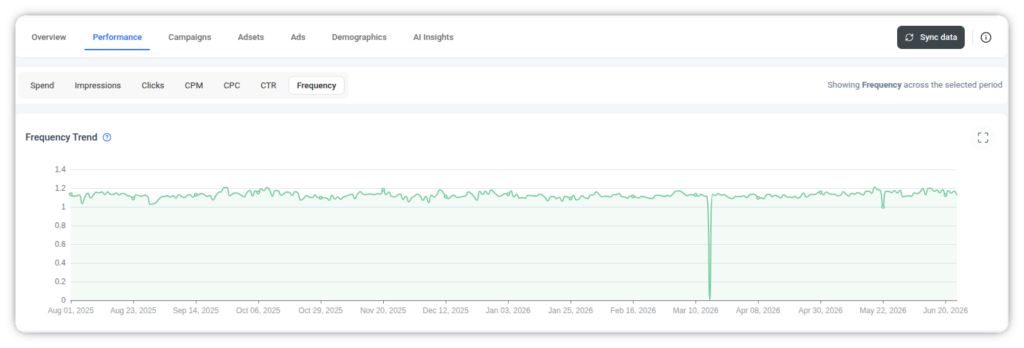
    Frequency is the average number of times each person saw your ad. It is impressions divided by reach, and it is one of the most overlooked numbers in the entire report. People check spend and results religiously and never once glance at frequency, and then wonder why a campaign that started strong slowly fell apart.

    Here is what happens. Early in a campaign, frequency is low, most people are seeing your ad for the first time, and performance is good. As the campaign runs, if your audience is not large enough to keep supplying fresh eyes, the same people start seeing the ad again and again. Frequency climbs. 

    Once it passes a certain point, usually somewhere around three or four exposures within a short window depending on your audience and creative, fatigue sets in. People have seen the ad, they have made their decision, and now they are just tuning it out.

    The damage shows up across the report. CTR drops because people stop clicking something they have already seen. CPM often rises because Meta struggles to place a stale ad efficiently. Cost per result creeps up as fewer clicks convert. From the outside, it looks like the whole campaign is decaying, when the real culprit is a single number quietly climbing in a column you never checked. 

    This is one of the places where an extra set of eyes helps. ContentStudio’s AI Insights reads the same numbers and flags a fatigue pattern for you, which is useful when frequency is the kind of thing that slips past a manual scan.

    Also Read: Meta Ads performance analysis: How to measure what’s working

    The conversion path: reading the steps between click and purchase

    A click and a purchase are not next to each other. Between them sits a series of steps, and Meta reports on each one. When a campaign is spending well and getting clicks, but the results are not coming, the answer is almost always hiding somewhere in this path. Reading it tells you not just that something is broken, but exactly where.

    The steps run in a rough sequence, and each has its own metric and cost per action:

    • Landing page views come right after the click. If you have plenty of link clicks but far fewer landing page views, people are clicking and then leaving before the page even loads. That points to a slow page, a broken link, or a mismatch between the ad and where it sends people.
    • Add to cart is the next signal of intent. A healthy view-to-cart drop-off tells you the offer is landing. A steep one tells you the page or the product is not convincing anyone.
    • Initiate checkout is the last step before the sale. People who reach checkout and do not finish are the most frustrating and the most recoverable, since the intent was clearly there. High checkout starts with low purchases usually means friction at the final step: unexpected shipping cost, a clunky form, or a payment problem.
    • Purchases are the outcome you already know from the results layer, sitting at the end of the path.

    Reading the layers together: a worked example

    This is where it all comes together. Reading a report is not about any single metric. It is about reading the layers in order and letting them tell you a story. Let me walk through a hypothetical campaign the way I actually would, top to bottom.

    Imagine a sales campaign with these numbers. Spend of four thousand dollars. Reach of two hundred thousand. Impressions of eight hundred thousand. CPM of five dollars. CTR of zero point eight percent. CPC of sixty cents. Results of eighty purchases. Cost per result of fifty dollars. ROAS of 2.5. Frequency of four.

    A beginner looks at that CTR of zero point eight percent, decides it is low, and starts panicking about the creative. But watch what happens when you read in order.

    • Objective first. This is a sales campaign, so the numbers that matter most are cost per result and ROAS, not CTR. Already the panic is misplaced.
    • Delivery layer. CPM of five dollars is reasonable. Spend is healthy. Nothing alarming here. But notice impressions are four times reach, which means frequency is going to be a factor.
    • Engagement layer. CTR of zero point eight percent is modest, but for a sales campaign targeting a warm audience, that is not unusual. CPC of sixty cents is fine.
    • Outcome layer. Eighty purchases at fifty dollars each, with a ROAS of 2.5. Whether that is good depends entirely on margin. If this product carries a healthy margin and repeat purchases, 2.5 is a solid, profitable campaign. The story so far is positive.
    • Frequency. Here is the catch. Frequency is four, and impressions are climbing far faster than reach. This campaign is profitable today, but it is heading for trouble.

    So the real read is not “the CTR is bad.” It is “this campaign is currently profitable but approaching fatigue, so refresh the creative or expand the audience before performance decays.” That is a completely different, and far more useful, conclusion than the one a column-by-column reader would reach.

    Now flip it. A campaign with a gorgeous CTR of three percent and a cheap CPC can still be a failure if the cost per result is triple your target and ROAS is below one. Great engagement, terrible outcome. Read in isolation, those top-line numbers look like a win. Read in order, they reveal a campaign that attracts clicks but does not convert them, which is a landing page or 

    From reading to reporting

    Reading a report well is one skill. Explaining it to someone else is another, and it is the one that gets overlooked. Your manager, your client, or your stakeholder does not want to see forty columns. They want to know three things: is it working, what did it cost, and what happens next. Your job when reporting is to translate the layers you just read into that plain answer.

    This is where the raw numbers become a narrative. Instead of handing over a screenshot of the dashboard, you say something like: the campaign is profitable at a ROAS of 2.5, it is approaching audience fatigue so we are refreshing the creative this week, and we expect that to protect the cost per result going forward. That single sentence contains the outcome layer, the frequency read, and the action plan, and it is worth more than the entire spreadsheet to the person receiving it.

    Doing this consistently and quickly is where good tooling earns its place. Pulling spend, results, CPM, CTR, and ROAS into one view rather than exporting and reassembling them saves the tedious part, and then it is a couple of clicks to export a clean, client-ready report. 

    Because ContentStudio keeps the ad data next to your publishing, your social analytics, and your content approvals rather than in a separate silo, the whole read-to-report loop happens in one place. For anyone managing reporting across several accounts or clients, that consolidation is the difference between a report that takes an afternoon and one that takes a few minutes.

    Bringing it all together

    Reading a Meta Ads report is not about memorizing benchmarks or knowing what a good CTR is in the abstract. It is about reading the right numbers in the right order and letting them build a picture. Start with the objective, because it decides which metrics matter. Check the delivery layer to see if you are paying a fair price to be seen. 

    Read the engagement layer to judge whether the ad is landing. Look at the outcome layer to find out if it did its job. And never skip frequency, because it is the quiet metric that explains most mysterious declines. Do this every time and the forty-column wall stops being intimidating. It becomes a report you can read in a couple of minutes and, more importantly, act on with confidence. 

    A dashboard that already groups results by objective and surfaces the metrics in order, the way ContentStudio’s does, takes some of the manual sorting off your plate, but the method is what matters. The numbers were always telling a story. Now you know how to read it.

    Frequently asked questions

    How do you read a Meta Ads report? 

    Read it in layers from the top down rather than column by column. Start with the campaign objective, since it decides which metrics matter, then work through delivery (spend, reach, impressions, CPM), engagement (CTR, CPC), outcome (results, cost per result, ROAS), and finally frequency. Reading in that order turns a wall of numbers into a clear diagnosis instead of a guess.

    What are the most important metrics in a Meta Ads report? 

    It depends on the objective, which is the whole point. For a sales campaign, the important metrics are cost per result and ROAS. For traffic, it is cost per link click and CTR. For awareness, it is CPM and reach. Frequency matters for every objective, because it quietly explains most performance declines.

    What is a good CTR, CPM, or ROAS on Meta Ads? 

    There is no universal number, because all three depend on your industry, audience, placement, and objective. A good CTR for a broad awareness campaign looks nothing like one for tight retargeting. The most reliable benchmark is your own account over time, so compare this month to last month rather than a figure from someone else’s business.

    Why is my Meta Ads CPM going up? 

    A rising CPM usually means one of three things: the auction for your audience has become more competitive, your audience is too small so Meta keeps showing your ad to the same people, or your creative has gone stale and its relevance is slipping. Check frequency at the same time, since a climbing CPM and a climbing frequency almost always travel together.

    What is the difference between reach and impressions on Meta Ads? 

    Reach is the number of unique people who saw your ad, while impressions is the total number of times it was shown, including repeat views. Impressions divided by reach gives you frequency, which tells you how often the average person is seeing your ad and is one of the earliest warnings of ad fatigue.

    How often should you check a Meta Ads report? 

    For most campaigns, a proper read two or three times a week is enough, with a quick glance at spend and results in between. Checking every few hours tempts you to react to noise before the algorithm has settled. If you manage several accounts, a dashboard that keeps every account’s metrics in one place, like ContentStudio, makes that regular check far quicker than jumping between exports.

    Can you view Meta Ads performance outside of Meta Ads Manager? 

    Yes. Meta Ads Manager holds the raw data, but many teams read and report on their ad performance in a dedicated dashboard instead, like ContentStudio, which pulls the metrics into one clean view and makes exporting client-ready reports simpler. That is useful when you are reporting to clients or stakeholders who should never have to log into Ads Manager themselves.